Hero Block
A Hero Block is a powerful visual element at the top of a webpage, designed to grab attention immediately. It typically includes:
- Background (Image/Video): A visually engaging element that sets the tone. It could be a high-resolution image, a looping video, or even an animation.
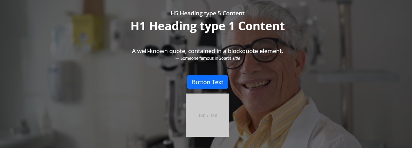
- Headline: A bold, concise statement that communicates the primary message. This is usually the most prominent text on the page.
- Subheadline: A smaller text that adds more detail or context to the headline.
- Call to Action (CTA): A button or link prompting users to take the next step, like signing up, learning more, or making a purchase.
- Overlay (Optional): Sometimes a semi-transparent overlay is added to ensure text readability over a complex background.
The hero Block Implementation is as follows. There are 12 types of hero HTMLs are there. Each type of hero section implementation is explained below one by one.
To start let’s see where the block is available and how to create and also know the property list of the Hero block.
Creating a Hero Block
Steps to create a header block:
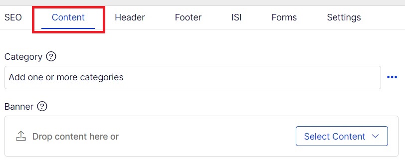
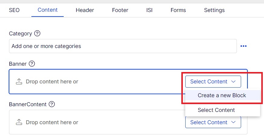
- Select content tab and You can add hero section in any contentArea.
- Create a block inside any contentArea section.
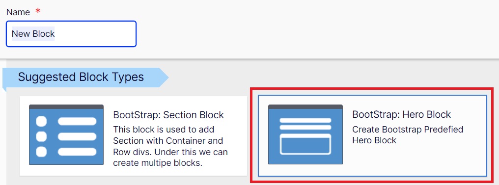
- Choose Bootstrap: BootStrap: Hero Block.
- Add all the required propertites.
Step 1
Step 2
Step 3
Step 4
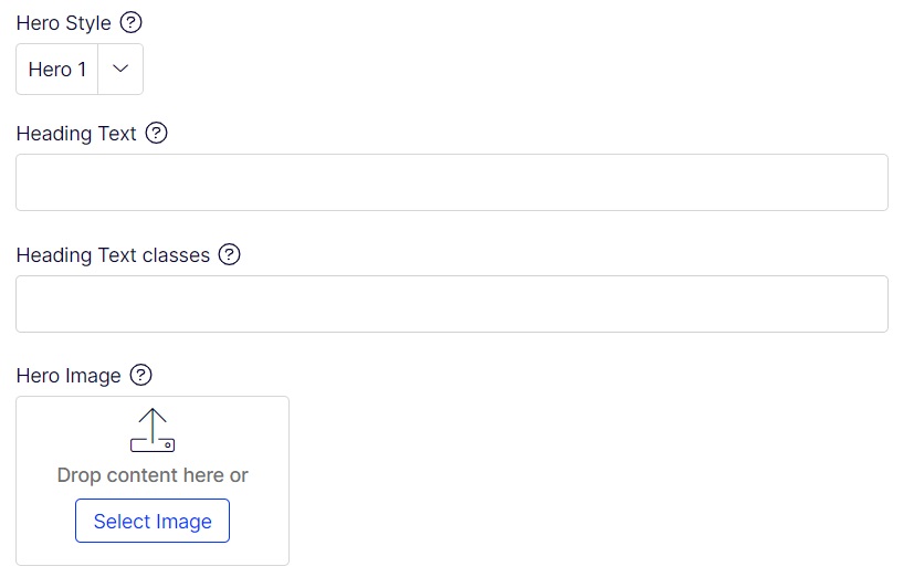
The Various properties are list below:
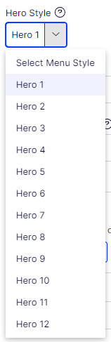
Hero Style:
This hero style can be chosen based on the Types of hero section you want to imp based on template site. It has list 1 to 12 types.
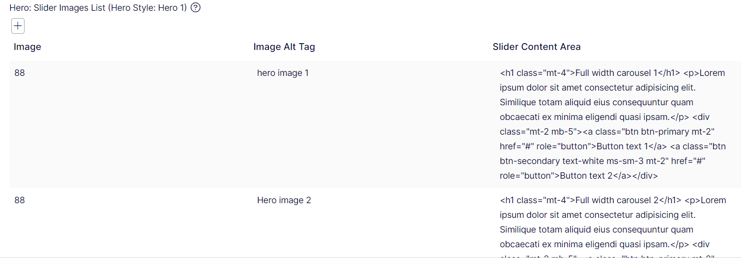
Hero: Slider Images List (Hero Style: Hero 1)
This property is used for Slider image list where in it collects list of images, images alt tags and htmls content for that section.
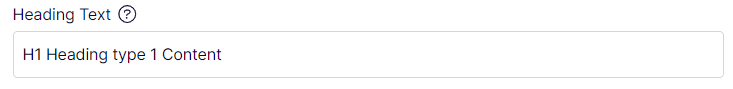
Heading Text:
This holds the H1 content which will be applied in h1 tag.
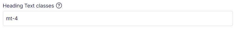
Heading Text classes:
This holds the Heading Text classes. multiple classes can be added.
Hero Image:
This property holds the Hero image path.
Hero Image Alt Tag:
Overlay Image:
This property holds the overlay image of the hero image to other dives. This property Applicable for Hero Style: Hero 7 implementation.
Overlay Image Alt Tag:
This property holds the overlay image alt tag text.
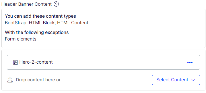
Header Banner Content:
This property holds the html content for this hero section. Mostly the contents are added using p tags, ul-li, div tags. Etc.
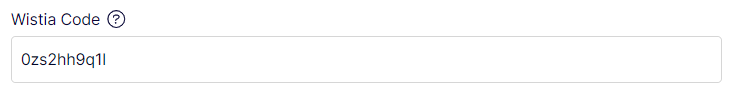
Wistia Code:
This property is used to hold wistia code of wistia video. This Video will be used for background videos if any.
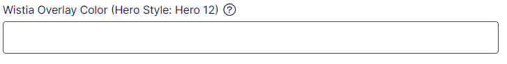
Wistia Overy Color:
This property holds the Overlay color code is any. This code is in this format “#00FFFF”.
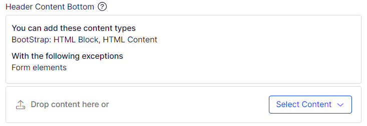
Header Content Botom:
This property holds the html content if any. This property is currently used in Hero-8 and Hero-10.
Hero-1
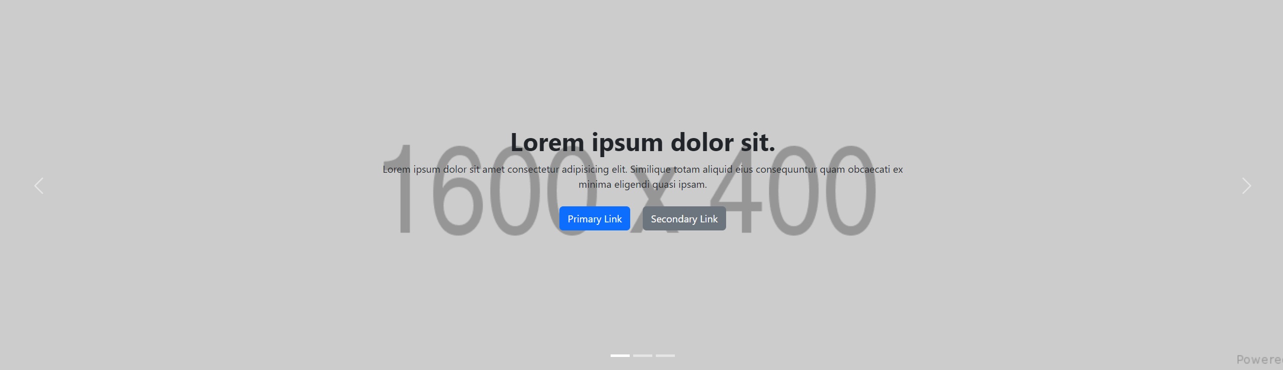
Required property:
| Hero: Slider Images List: | List of Image name, Image altag name, and Html content update | |
| Hero Style: | Hero 1 | |
| Heading Text: | Text field for heading | |
| Heading Text Classes: | class if any for heading text | |
| Header Banner Content: | html content if any for this. |
Hero-2
Required property:
| Hero Style: | Hero 2 | |
| Heading Text: | Text field for heading | |
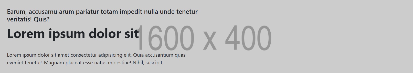
| Hero Image: | Image path (1600x400 size) | |
| Hero Image Alt Tag: | Alt tag name for the hero image. | |
| Header Banner Content: | html content if any for this. |
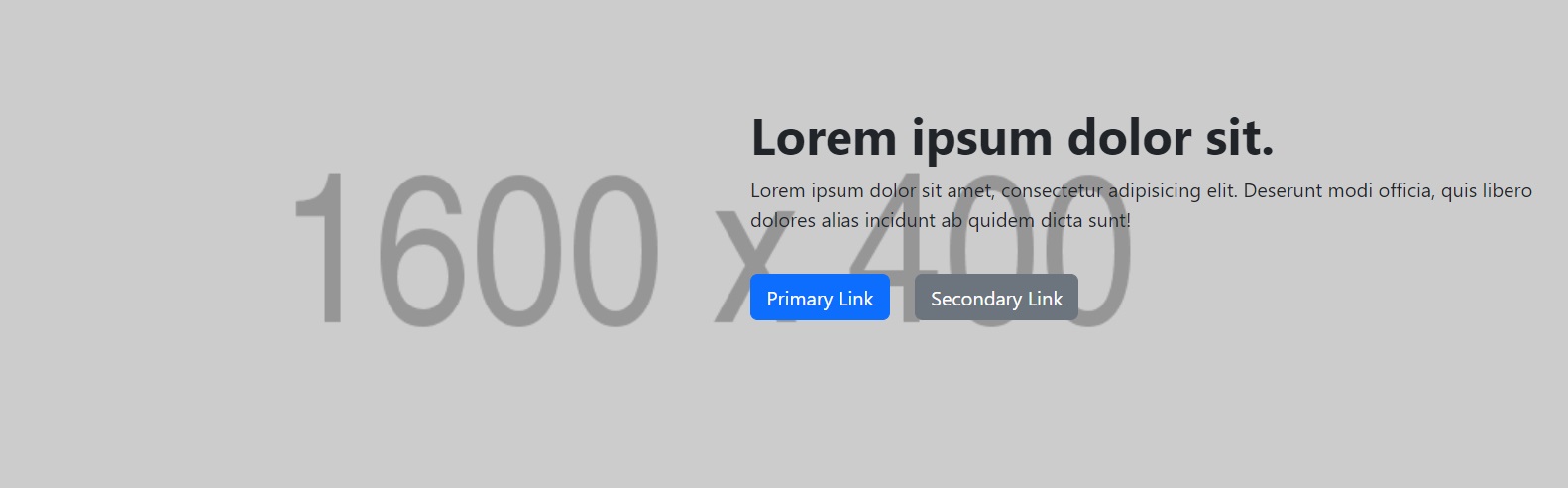
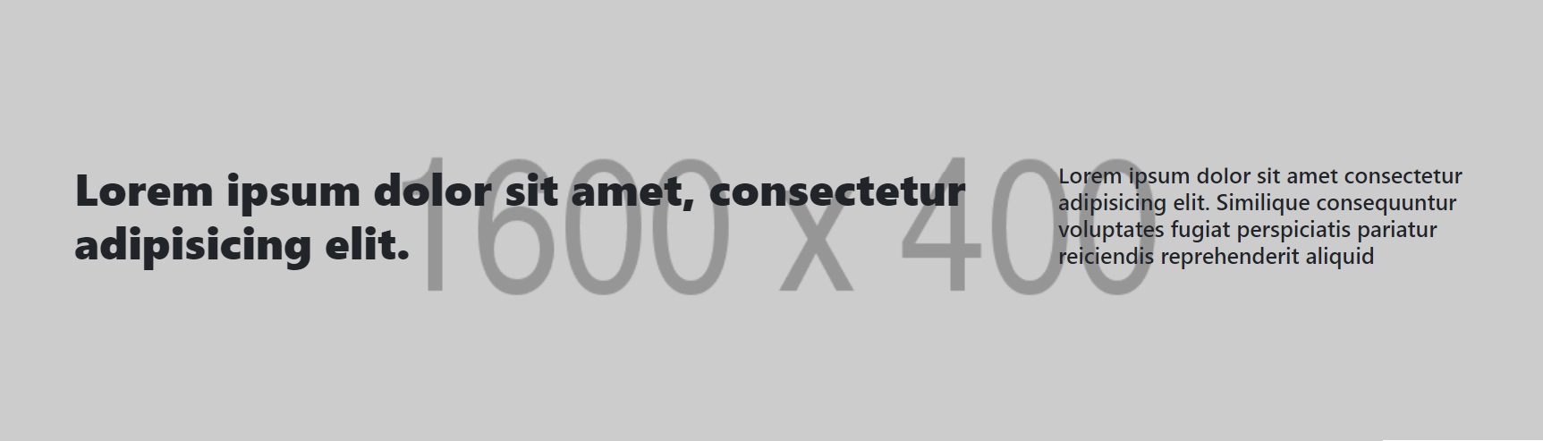
Hero-3
Required property:
| Hero Style: | Hero 3 | |
| Heading Text: | Text field for heading | |
| Hero Image: | Image path (1600x400 size) | |
| Hero Image Alt Tag: | Alt tag name for the hero image. | |
| Header Banner Content: | html content if any for this. |
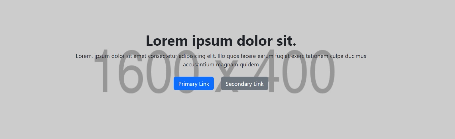
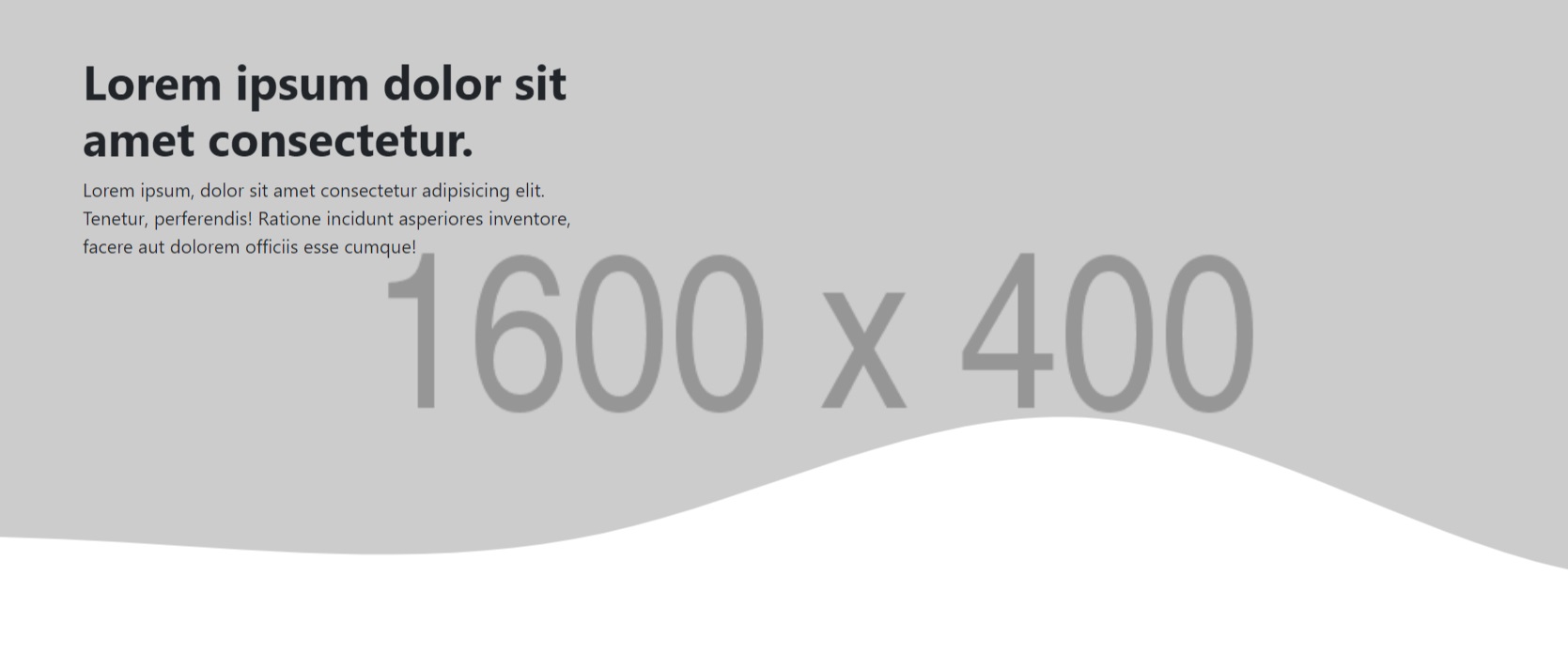
Hero-4
Required property:
| Hero Style: | Hero 4 | |
| Heading Text: | Text field for heading | |
| Hero Image: | Image path (1600x400 size) | |
| Hero Image Alt Tag: | Alt tag name for the hero image. | |
| Header Banner Content: | html content if any for this. |
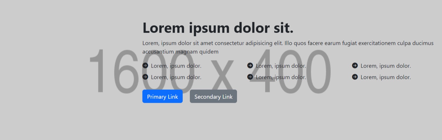
Hero-5
Required property:
| Hero Style: | Hero 5 | |
| Heading Text: | Text field for heading | |
| Hero Image: | Image path (1600x400 size) | |
| Hero Image Alt Tag: | Alt tag name for the hero image. | |
| Header Banner Content: | html content if any for this. |
Hero-6
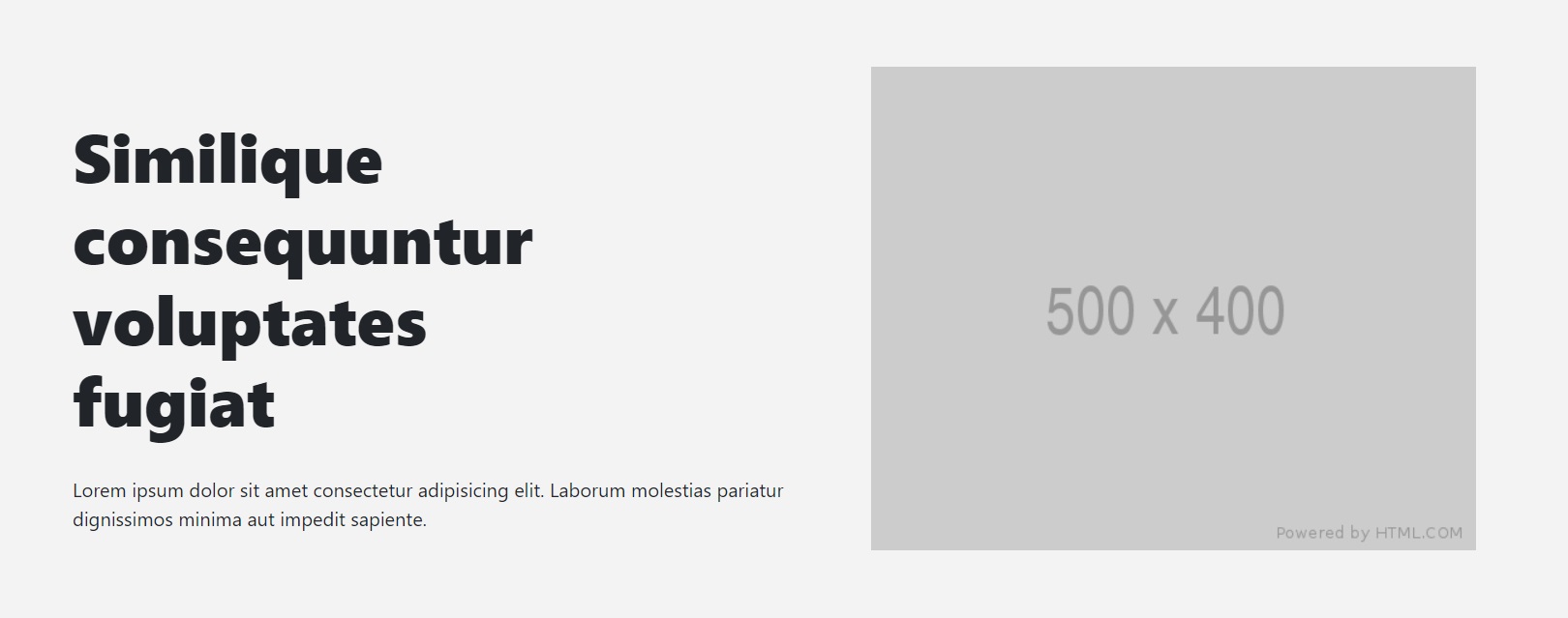
Required property:
| Hero Style: | Hero 6 | |
| Heading Text: | Text field for heading | |
| Hero Image: | Image path (500x400 size) | |
| Hero Image Alt Tag: | Alt tag name for the hero image. | |
| Header Banner Content: | html content if any for this. |
Hero-7
Required property:
| Hero Style: | Hero 7 | |
| Heading Text: | Text field for heading | |
| Hero Image: | Image path (1600x400 size) | |
| Hero Image Alt Tag: | Alt tag name for the hero image. | |
| Overlay Image: | Image path (1600x400 size) | |
| Overlay Image Alt Tag: | Alt tag name for the hero overlay image | |
| Header Banner Content: | html content if any for this. |
Hero-8
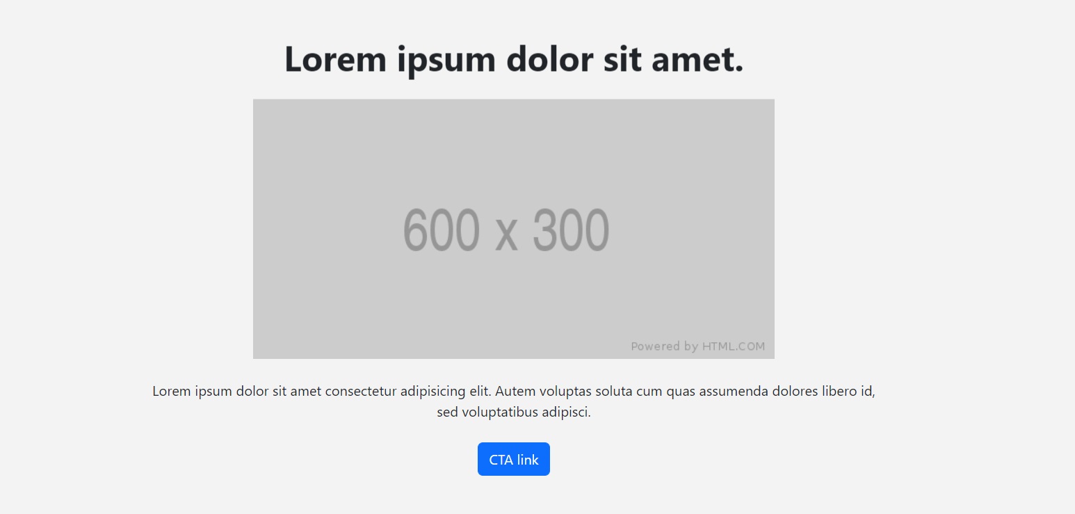
Required property:
| Hero Style: | Hero 8 | |
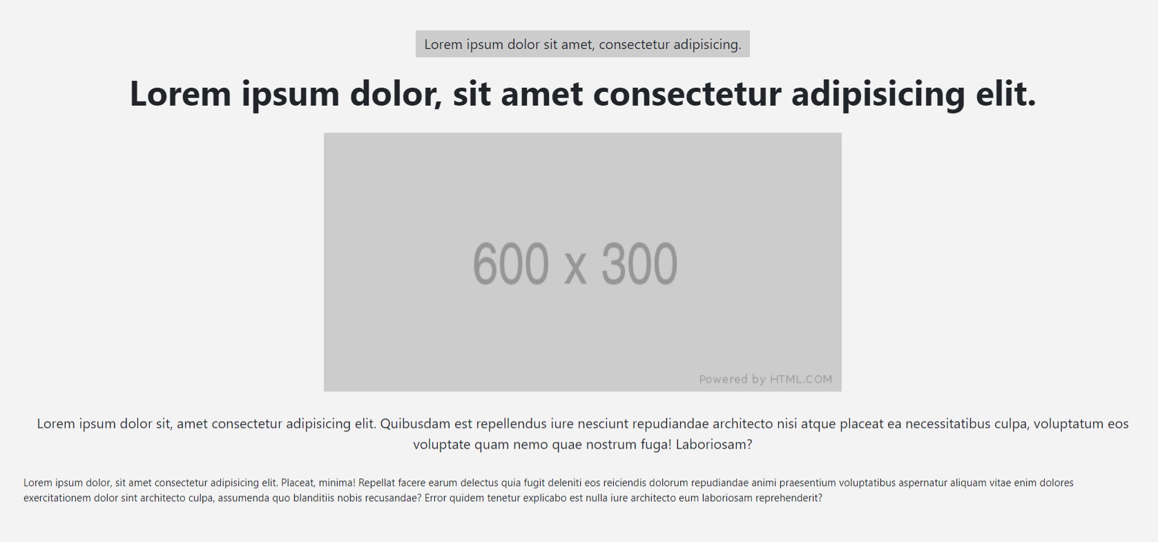
| Heading Text: | Text field for heading | |
| Hero Image: | Image path (600x300 size) | |
| Hero Image Alt Tag: | Alt tag name for the hero image. | |
| Header Banner Content: | html content if any for this. |
Hero-9
Required property:
| Hero Style: | Hero 9 | |
| Hero Image: | Image path (530x300 size) | |
| Hero Image Alt Tag: | Alt tag name for the hero image. | |
| Header Banner Content: | html content if any for this. |
Hero-10
Required property:
| Hero Style: | Hero 10 | |
| Hero Image: | Image path (600x300 size) | |
| Overlay Image Alt Tag: | Alt tag name for the hero overlay image | |
| Header Banner Content: | html content if any for this. | |
| Header Content Bottom: | html content if any for this. |
Hero-11
Required property:
| Hero Style: | Hero 11 | |
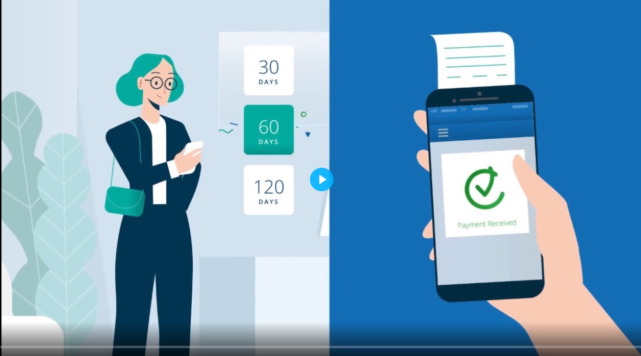
| Wistia Code: | Background video code as per wistia shared for uploaded video |
Hero-12
Required property:
| Hero Style: | Hero 12 | |
| Hero Image: | Image path (1600x400 size) | |
| Header Content Bottom: | html content if any for this. | |
| Wistia Code: | Background video code as per wistia shared for uploaded video | |
| Wistia Overlay Color: | Color code to be given in RGB | |
| Header Banner Content: | html content if any for this. |