Bausch Corporate Website Blocks
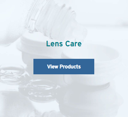
BL-HomeBlock
The Block type is used to provide the blocks in Home page and product tile in product pages.

Required property:
| Number of Columns: | To provide the number of columns to be displayed in a single row | |
| Stock Sticker: | Since this block is used for multiple purposes, the ‘Stock Sticker’ option is present, which is not needed in this case; set it to ‘No’ | |
| Heading: | Product heading (H2) is provided here | |
| Background & Mobile Background Images: | Used to provide background images for larger & smaller devices respectively | |
| Button Color: | Since this block is used at multiple places across the site, the ‘Button Color’ option is present, which is set to ‘Blue’ in this case | |
| Button Text: | Used to provide the button text here | |
| Button Link: | Used to provide the link to individual product page | |
| Link Type: | Used to provide the type of link the button redirects to | |
| Description: | Used to provide the description of the block |
BL-AnchorLinksblock
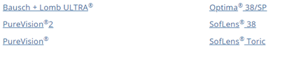
Required property:
| Short Description: | To provide short description/ sub heading above the jump links | |
| Left Anchor List: | Anchor list has ‘Link Name’ & ‘Anchor Unique Id’ properties. Link Name is used to provide the product name. Numbers or characters or a combination of both can be provided as Anchor Unique Id. | |
| Right Anchor List: | Anchor list has ‘Link Name’ & ‘Anchor Unique Id’ properties. Link Name is used to provide the product name. Numbers or characters or a combination of both can be provided as Anchor Unique Id. |
Note: Anchor ids should not be repeated and must be unique for every product. The number of products must be evenly distributed among the left & right anchor lists.
BL-NewProductBlock
The Block type is used for displaying product details
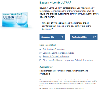
Required property:
| Number of Columns: | This property is set to ‘Full Width’ | |
| Text Alignment: | This property is set to ‘Left’ | |
| Product Desktop & Mobile Images: | Used to provide product images for larger & smaller devices | |
| ImageAlternative Text: | Alternative text for image is provided here | |
| Title: | The product title (H2) is given here along with the anchor tag. The anchor Id provided in jump link in the previous component is linked with the product title | |
| Subheading: | Product subheading is provided here | |
| Description: | Product description is provided here | |
| Consumer & Professional Buttons: | Consumer & professional button texts are provided here | |
| Consumer & Professional Links: | URLs to which Consumer & Professional buttons redirect to are given here | |
| More Information: | Subheading for the links is provided here | |
| More Information List: | Link name, link URL and link type are specified. Link type can be ‘Website’ or ‘PDF’ depending on the URL. | |
| ISI Description: | Subheading (H3) along with symptoms or Important Safety Information (ISI) is provided here | |
| ISI Links: | Link that jumps to the full ISI of a product within the same page. Link name, link type and anchor unique id are provided. | |
| Extra Description: | The footnotes of the product are provided here |
BL-CTA-Txt-Link
The Block type is used for the ISI of a product

Required property:
| Number of Columns: | This property is set to ‘Full Width’ | |
| Text Alignment: | This property is set to ‘Left’ | |
| Title: | Product title (H3) for ISI is provided here and linked with the anchor id (if provided) in the previous component | |
| Description: | Detailed ISI of the product is provided here |
BL-ContentAreaBlock
The Block type is used when multiple blocks need to be given as a single component. It can contain two or more blocks of the same or different type. This block is used in most of the template 6 due to spacing requirements
Required property:
| Background Color: | This property is used to give background color to the page. | |
| No Of Blocks: | This property can be set to ‘Two’ or ‘Three’ depending on the total number of blocks contained within the content area block | |
| Background color Checkbox: | This property is used to apply background color to the entire width of the page rather than the content area block space alone | |
| ContentArea: | This content area is used to add blocks |
BL- CTA-ImgPos-TxtPos-Btn-BgClr
The Block type is block is used in multiple places when image needs to be placed at the right or left of a content (with/ without button)
Required property:
| Number of Columns: | This property is set based on number of blocks required in the same row. So it will be set to ‘One-By-Two’ when two blocks are needed or ‘One-Fourth’ when three blocks are needed and so on | |
| Image position: | This property sets the image position | |
| Background Color: | This property is used to apply background color to the entire width of the page rather than the content area block space alone | |
| Link Type: | This content area is used to add blocks | |
| Subheading: | Block title (H2) is given here | |
| Description: | Block description is given here | |
| Button Text and Link: | Button text and the corresponding link (if present) are given here | |
| Image & Mobile Image: | These properties are used to provide the images for larger & smaller devices respectively | |
| Image Alternative text: | Alternative text for the image is given here |
BL-CTA-Img-Txt-Btn-BgClr
The Block type is block is used in multiple places when image needs to be placed at the right or left of a content (with/ without button)

Required property:
| Number of Columns: | This property is used to set based on number of blocks | |
| Image Shape: | This property is used to specify the shape of the image as ‘Round’ or ‘Square’ | |
| Text Alignment: | This property is set to ‘Left’ | |
| Background Color: | This property is used to set the background color of the block | |
| Image: | This property is used to provide the image for larger & smaller devices | |
| Image Alternative text: | Alternative text for the image is given here | |
| Title: | Content title is given here | |
| Body Copy: | Content description is given here | |
| Button Text & Link: | Button text & link are given here |
BL-PromoBlock
The Block type is block is used for image, text and button which is contained in a box and the icon is placed on the top on the outline of the block
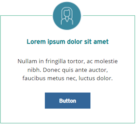
Required property:
| Number of Columns: | This property is used to set based on number of blocks | |
| Button Text & Link: | Button text & link are provided | |
| Link Type: | This property is used to specify whether the button URL is a website or PDF | |
| Image: | The icon placed on the top center of the block is placed here | |
| Image alternative Text: | Alternative text for the image is given here | |
| Name: | Alternative text for the image is given here | |
| Description: | Content description is provided |
BL-QuoteBlock
The Block type is block is used to give the quotes (with/ without button)
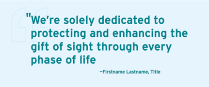
Required property:
| Background Color: | This property is used to set the background color of the block | |
| Image: | This property is used to provide the quote image which appears in the background of the text | |
| Quote: | This property is used to provide the quote along with the closing quotation | |
| Firstname Lastname: | This property is used to mention the name of the author who said the quote | |
| Pull Quote & quote Buttons: | These properties are used to provide the texts of the buttons | |
| Pull Quote & quote Links: | These properties are used to provide the links of the corresponding texts |
Note: The opening Quotations need not be provided in the Quote block. It automatically appears from the code. Only closing quotation marks are expected to be given along with the quote in the block
BL-ComponentWithBioBlock
The Block type is used to give a detailed description about executive management team & board of directors.
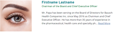
Required property:
| Unique Id: | This property is used to set an Id that is unique to this block | |
| Image: | This property is used to provide the quote image which appears in the background of the text | |
| Title & Subtitle: | Heading & subheading of the block is provided | |
| Link: | This property is used to give a link which, on clinking, shows the rest of the content that is hidden | |
| Bio Description: | Description of the block is given here |
BL-Component13Block
The Block type is used to provide multiple blocks that contain a title & link, side by side. These blocks are separated by a border in between.

Required property:
| Number of Columns: | This property is used to set based on number of blocks | |
| Title: | Block title (H2) is provided here | |
| Link text & Link: | Link text and the corresponding URL are given |
BL- Accordion
The block is used when hidden content needs to be displayed on clinking the ‘+’ icon and hidden again on clinking the ‘-‘ icon.
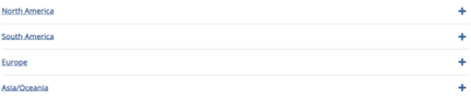
Required property:
| Number of Columns: | To provide the number of columns to be displayed in a single row | |
| Unique ID: | This property is used to set an Id that is unique to this block | |
| Heading: | The heading of the Accordion block is provided here | |
| Description: | The content of the Accordion block is provided here. |
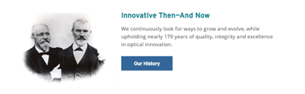
BL- Component15
The block consists of image on the left & title, content and button on the right.

Required property:
| Background Color: | This property is used to set the background color of the block | |
| Link Type: | This property is used to specify whether the button URL is a website or PDF | |
| Title: | Block title (H2) is given here | |
| Description: | Block description is given here. | |
| Button text & Link: | Button text & link are provided. | |
| Image: | This property is used to provide the image for larger & smaller devices. | |
| Image alternative Text: | Alternative text for the image is given here. |
BL- HeroBanner
The block consists of image on the left & title, content and button on the right.

Required property:
| Desktop Image and Mobile Image: | To provide the number of columns to be displayed in a single row | |
| Image Alternative Text: | This property is used to set an Id that is unique to this block | |
| Heading: | Block title (H2) is given here | |
| Description: | Block description is given here |
BL-ThankYouBlock
The block consists of a content area.
Required property:
| ContentArea: | This property is used to add more blocks within the same block. |
BL-ContactUsBlock
The block consists of an XhtmlString that is displayed at the right half of the webpage.
Required property:
| Number of Columns: | To provide the number of columns to be displayed in a single row | |
| Data: | This property is used to set an Id that is unique to this block |
BL- RxBlock4_1
The block consists of a generic list of Drug name, dosage and its corresponding pdf link.
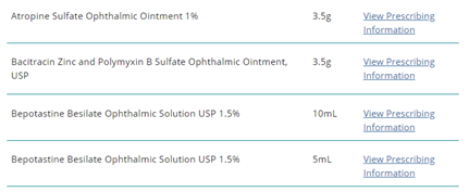
Required property:
| Rx Alphabetical: | List of Product Description (Drug name), Product Description1 (dosage) and Information Text and link (pdf text & link) are provided. |